Create Custom 360 Reports with Visuals and Dashboards (Beta)

Background

360 Reporting offers multiple visual formats, such as bar graphs, tables, and scorecards, allowing you to choose the best way to represent your data. Because each visual type has unique requirements—like defining axes for a graph versus selecting columns for a table—the specific configuration steps will vary depending on the format you select.

Things to Consider

Steps

With the 360 Reporting tool, users can select from these custom data visuals when creating new reports:
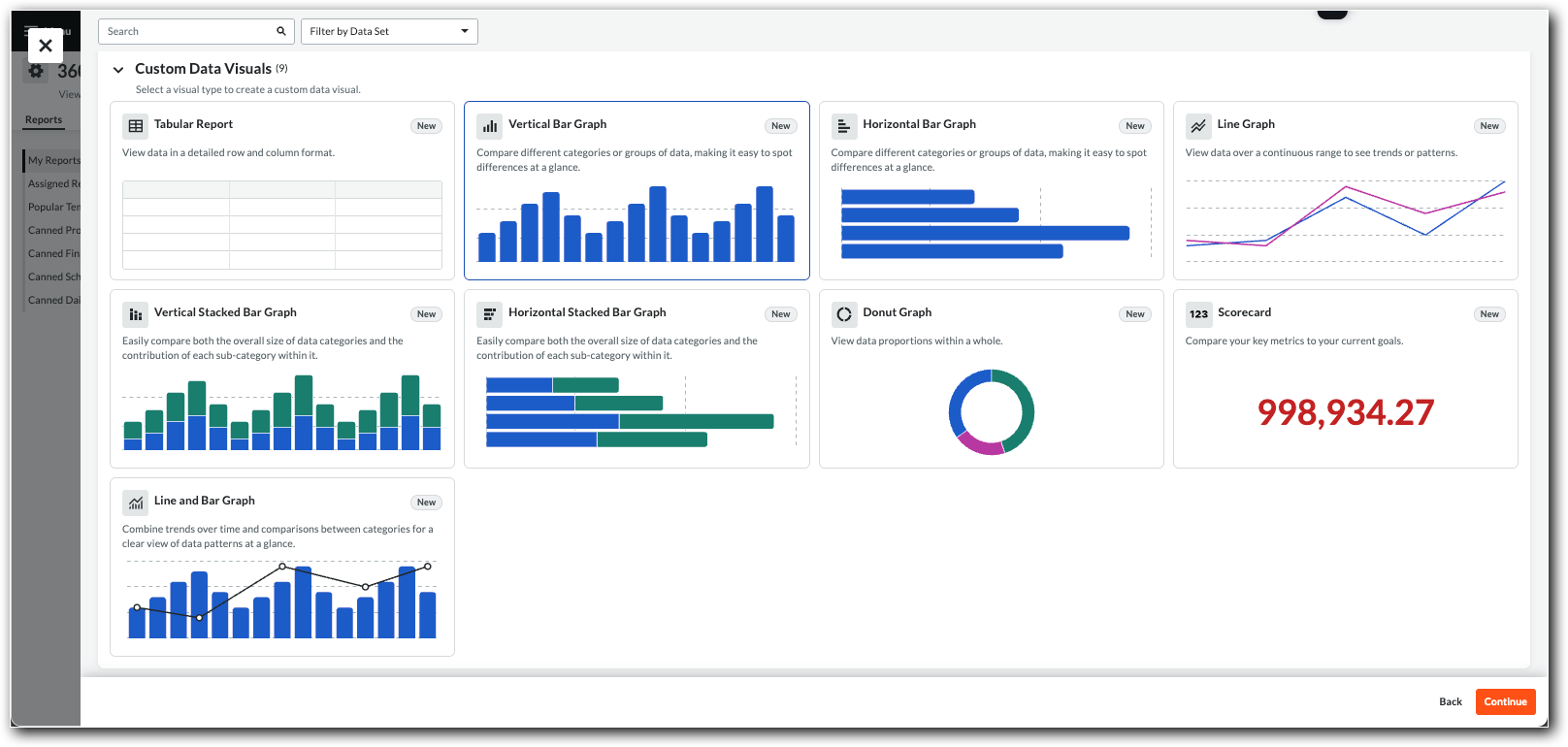
This is the 360 Reporting tool's Custom Data Visual panel showing the Tiles for Visual Types.

With the 360 Reporting tool, users can select from these custom data visual types when creating new reports:

This is the 360 Reporting tool's Custom Data Visual panel showing the Tiles for Visual Types.

Tip

New to 360 Reporting? See these learning resources:

Expand the steps below to learn how to create your own reports using the Create Visuals option.

Tabular Report

A tabular report organizes data into a grid of rows and columns for detailed granular data needs.

To configure a report:

Best Practice

How many columns should you include in a report? The number of columns in your table depends on the data being presented, your goal, and the medium (online vs. print). Some best practices when building reports are:

  • Avoid overwhelming the user and include only the columns necessary to understand the data or complete a task.

  • When building a report for print, consider the physical page width and font legibility.

  1. Navigate to the 360 Reporting tool.

  2. Click Create Report. Then select the 360 Report (Visuals and Dashboards) option.

  3. Select the Tabular Report tile and click Continue again.

  4. Select a data set tile and click Continue again. For data sets, see 360 Reporting: Data Guide.

  5. On the Visual tab, use the Search Columns box or expand the arrows to find and mark the checkboxes for the columns to add.

  6. Optional: Apply Filters or Calculations. See Configure Filters, Calculations, and Info for 360 Reports.

  7. The Load Data Manually toggle is turned ON by default to improve performance for large data sets. You can choose to turn this feature OFF.

  8. Click Add to 360 Report. To add another visual, click Add Visual and repeat the steps.

  9. When finished, click Save.

Vertical Bar Graph

A vertical bar graph uses vertical bars of varying heights to compare the quantities of different categories side-by-side.

To configure a report:

Best Practice

How should you configure your vertical bar graph for clarity? A vertical bar graph is excellent for comparing a numeric value (like Cost or Count) across distinct categories (like Assignee or Project Name). To ensure your chart is effective and easy to read, consider these best practices:

  • Limit the Number of Bars: Avoid overwhelming users with too many bars. Use the Max Bars Displayed setting to focus on the most relevant data (e.g., the Top 10 or 15 categories).

  • Sort Your Data Logically: Since categories on the Horizontal Axis (like 'Name' or 'Assignee') often have no natural order, sort the chart by the Bar Measure (i.e., numeric value) in Descending or Ascending order. This makes it easier to compare values by identify highs and lows.

  • Use Clear Formatting: Use the Display Units (e.g., 'Thousands', 'Millions') to simplify large numbers on the Y-axis, and consider turning the Show Value Labels toggle ON if precise values are important to your audience.

  1. Navigate to the 360 Reporting tool.

  2. Click Create Report, select the 360 Report Visuals and Dashboards Open Beta option and click Continue

  3. Select the Vertical Bar Graph tile, click Continue, select your data set, and click Continue again. For data sets, see 360 Reporting: Data Guide.

  4. Set the Vertical Axis (Y-Axis): Click the Bar Measure menu and select a numeric field (e.g., 'Cost', 'Count') and a Color.

  5. Set the Horizontal Axis (X-Axis): Click the Horizontal Axis menu and select a category field (e.g., 'Assignee', 'Name').

  6. Optional: Turn the Show Value Labels toggle ON to include value labels on the chart.

  7. Set the chart's Sort by setting by selecting Ascending or Descending for the Bar Measure or Horizontal Axis.

  8. Expand Advanced Options to configure settings like Max Bars Displayed, Display Units, and Vertical Axis Min/Max.

Horizontal Bar Graph

A horizontal bar graph uses horizontal bars of varying lengths to compare values between different items, often used when category names are long.

To configure a report:

Best Practice

When is a horizontal bar graph the right choice? A horizontal bar graph is good for comparing a numeric value (like 'Cost' or 'Count') across categories that have long labels (e.g., 'Assignee' or 'Project Name'). The vertical layout gives ample space for the text, preventing it from being angled or cut off. Some best practices when building horizontal bar graphs are:

  • Prioritize Readability for Labels: Use this chart type specifically when your Vertical Axis (category) labels are long. This is its primary advantage over a vertical bar graph, as it gives more space for longer labels..

  • Sort by Value, Not Name: For clear insights, set the Sort by setting to your Bar Measure (the numeric value) and select Descending or Ascending. Sorting categories alphabetically is rarely as useful as seeing them ranked by value.

  • Limit the Number of Bars: Avoid cluttering the chart, which can make it harder to read. Use the Max Bars Displayed setting to focus the user's attention on a manageable number of items, such as the "Top 15" or "Bottom 10" categories.

  1. Navigate to the 360 Reporting tool.

  2. Click Create Report, select the 360 Report (Visuals and Dashboards) option, then click Continue

  3. Select the Horizontal Bar Graph tile, click Continue, select your data set, and click Continue again. For data sets, see 360 Reporting: Data Guide.

  4. Set the Horizontal Axis (X-Axis): Click the Bar Measure menu and select a numeric field (e.g., 'Cost', 'Count') and a Color.

  5. Set the Vertical Axis (Y-Axis): Click the Vertical Axis menu and select a category field (e.g., 'Assignee', 'Name').

  6. Optional: Turn the Show Value Labels toggle ON to include value labels on the chart.

  7. Set the chart's Sort by setting by selecting Ascending or Descending for the Bar Measure or Vertical Axis.

  8. Expand Advanced Options to configure settings like Max Bars Displayed, Display Units, and Horizontal Axis Min/Max.

Line Graph

A line graph displays data points connected by lines to show a trend or progression of a value over a period of time. 

To configure a report:

Best Practice

When is a line and bar graph the right choice? This "combo" chart is ideal for showing the relationship between two different measures over the same category, which is almost always time (like 'Month', 'Quarter', or 'Year'). It allows you to plot a primary measure as a bar (e.g., 'Actual Cost' or 'Actual Hours') and a secondary, related measure as a line (e.g., 'Estimate at Completion' or 'Actual Production Rate') on the same visual.

Some best practices when building line and bar graphs are:

  • Use a Dual Vertical Axis: The bar measure (e.g., 'Cost' in dollars) and the line measure (e.g., 'Count' in units) will almost always have different scales. Turn the Use Dual Vertical Axis option on so each measure has its own Y-axis (one on the left, one on the right).

  • Assign Measures Logically: Use the bars for volume or magnitude data (like 'Unit Quantity'). Use the line to represent a trend, rate, or average (like 'Unit Cost' or 'Unit Sales').

  • Use Time on the X-Axis: The Horizontal Axis should represent a continuous progression, with time ('Received Date' or 'Si) being a common and effective category. This shows how the two measures trend together over time.

  • Keep it Simple and Clear: Always Show Legend so users can easily distinguish the line measure from the bar measure.

  1. Navigate to the 360 Reporting tool.

  2. Click Create Report, select the 360 Report (Visuals and Dashboards) option. 

  3. Select the Vertical Stacked Bar Graph tile, click Continue, select your data set, and click Continue again. For data sets, see 360 Reporting: Data Guide.

  4. Set the primary Line Measure: Click the menu, select a numeric field (e.g., 'Cost'), then set the Line Width and Color.

  5. Optional: Set the Additional Line Measure: Click the menu, select another numeric field, Line Width, and Color.

  6. Set the Horizontal Axis (X-Axis): Click the menu and select a category field (e.g., 'Assignee', 'Name').

  7. Configure optional display settings: Turn on Show Legend (select Top or Bottom), Show Value Labels, or Show Points on Line.

  8. Set the chart's Sort by preference and expand Advanced Options to configure settings like Display Units, Use Dual Vertical Axis, or Scale Vertical Axis Logarithmically.

Vertical Stacked Bar Graph

A vertical stacked bar graph is a type of bar chart that shows the total for each category while also displaying the contribution of different sub-categories within each vertical bar.

To configure a report:

Best Practice

When should you use a vertical stacked bar graph? Use for tracking both the total of a measure and its composition across different categories. It is most powerful when used to show a part-to-whole relationship. For example, you could track the total RFI Count (the bar’s total length) for each RFI Assignee (the category) and stack by Status (the component parts of the bar). 

Some best practices when building vertical stacked bar charts are:

  • Limit Stacked Segments: To avoid a cluttered and unreadable chart, use a Stack by or Legend field that has a limited number of distinct values (ideally five or fewer). Too many colors can make the chart seem cluttered.

  • Compare Categories and Subcategories: This chart's best use case is to compare categories and their internal breakdown. For example, you could show the distribution of submittals by Responsible Contractor (the main category) and then stack by Status (the subcategory).

  • Consider a 100% Stacked Bar: If your main goal is to compare the proportion of the segments (the percentage breakdown) rather than the total, a 100% Stacked Bar (where every bar is the same height) is a much clearer and more effective visual.

  1. Navigate to the 360 Reporting tool.

  2. Click Create Report, select the 360 Report (Visuals and Dashboards) option, then select the Create Visuals tile and click Continue.

  3. Select the Vertical Stacked Bar Graph tile, click Continue, select your data set, and click Continue again. For data sets, see 360 Reporting: Data Guide.

  4. Set the primary Bar Measure: Click the menu, select a field, then set the Stack By field, and Horizontal Axis.

  5. Choose a Stack By Value and Color.

  6. Optional: Turn on Show Legend (select Top or Bottom) and Show Value Labels.

  7. Set the chart's Sort By preference and expand Advanced Options to configure settings like Decimal Places, Display Units, Max Bars Displayed, Vertical Axis Min, and Vertical Axis Max.

Horizontal Stacked Bar Graph

A horizontal stacked bar graph uses horizontal bars to compare totals across categories while breaking down the composition of each total into its constituent parts.

To configure a report:

Best Practice

When should you use a horizontal stacked bar graph? Use for tracking both the total of a measure and its composition across different categories. It is most powerful when visualizing data that has a part-to-whole relationship. For example, you could track the total RFI Count (the bar’s total length) for each RFI Assignee (the category) and stack by Status (the component parts of the bar). 

Some best practices when building horizontal stacked bar charts are:

  • Limit Stacked Segments: To avoid a cluttered and unreadable chart, use a Stack by or Legend field that has a limited number of distinct values (ideally five or fewer). Too many colors can make the chart seem cluttered.

  • Compare Categories and Subcategories: This chart's best use case is to compare categories and their internal breakdown. For example, you could show the distribution of submittals by Responsible Contractor (the main category) and then stack by Status (the subcategory).

  • Consider a 100% Stacked Bar: If your main goal is to compare the proportion of the segments (the percentage breakdown) rather than the total, a 100% Stacked Bar (where every bar is the same height) is a much clearer and more effective visual.

  1. Navigate to the 360 Reporting tool.

  2. Click Create Report, select the 360 Report (Visuals and Dashboards) option.

  3. Select the Horizontal Stacked Bar Graph tile, click Continue, select your data set, and click Continue again.

  4. Set the primary Bar Measure: Click the menu, select a field, then set the Stack By field.

  5. Set the Vertical Axis (Y-Axis): Click the menu and select a category field (e.g., 'Assignee', 'Name').

  6. Choose a Stack By Value and Color.

  7. Optional: Turn on Show Legend (select Top or Bottom) and Show Value Labels.

  8. Set the chart's Sort by preference and expand Advanced Options to configure settings like Decimal Places, Display Units, Max Bars Displayed, Horizontal Axis Min, and Horizontal Axis Max.

Donut Graph

A donut graph is a circular chart, like a pie chart with a hollow center, that shows the proportional contribution of each part to a whole. 

To configure a report:

Best Practice

When is a donut graph the right choice? A donut graph is an ideal visual to display part-to-whole relationships regarding project health. It is best used when you need to show the status breakdown of a specific tool (e.g., 'RFIs by Status' or 'Punch List Items by Status') to identify bottlenecks quickly. Unlike a pie chart, the center "hole" allows you to show totals, giving users immediate context about the relationship.

Some best practices when building donut graphs are:

  • Limit Categories for Clarity: Donut graphs become unreadable if you try to display every single trade or cost code. A better option is slicing the donut by Status (e.g., 'Open', 'Closed', 'Draft', 'Void').

  • Show Totals in the Center: The defining feature of a donut graph is the empty center. Turn the Show Total toggle on to display the Total Count (e.g., '150 Total RFIs'). This allows users to see the total scope of work immediately, while the ring shows how much of that work is completed versus outstanding.

  • Use Colors: Color carries meaning. Match your slice colors to the status message. For example, when visualizing 'Observations by Status,' use Red for 'Overdue,' Yellow for 'Ready for Review,' and Green for 'Closed.' This allows users to assess risk without reading the labels.

  1. Navigate to the 360 Reporting tool.

  2. Click Create Report, select the 360 Report option, then select the Create Visuals tile and click Continue.

  3. Select the Donut Graph tile, click Continue, select your data set, and click Continue again. For data sets, see 360 Reporting: Data Guide.

  4. In the Configure Table panel, click the Visual tab.

  5. Set the primary Donut Measure: Click the menu, select a field, then set the Slice By field.

  6. Mark the Slice Display check boxes: Label, Value, and Percent.

  7. Choose a Slice Value and Color.

  8. Optional: Turn on the Show Total, Show Legend (select Top or Bottom), and Show Value Labels.

  9. Set the chart's Sort by preference and expand Advanced Options to configure settings like Decimal Places and Display Units.

Scorecard

A scorecard is a report that prominently displays a single, critical Key Performance Indicator (KPI) to provide a quick, high-level snapshot of performance.

To configure a report:

Best Practice

When is a scorecard the right choice? A scorecard is an effective visual for displaying a single, critical Key Performance Indicator (KPI) for at-a-glance monitoring. It provides a snapshot of a metric's current status (e.g., 'Total Revenue', 'Open Cases', or 'Avg. Uptime'). Its ideal position is at the top of a dashboard.

Some best practices when building scorecards are:

  • Focus on One Key Metric: Each scorecard tile should represent one, and only one, primary value. Its power is in its simplicity. Avoid cluttering it with secondary information that belongs in a different chart.

  • Provide Essential Context: Always pair your Primary Value (the main KPI) with a Secondary Value for comparison. A number by itself is not insightful.

  • Use Clear and Concise Labels: Use the Title to clearly name the KPI (e.g., 'YTD Sales') and use Display Units (like 'Thousands' or 'Millions') to make large numbers easy to digest.

  • Use Conditional Formatting: Apply color to signal performance. Set up rules to change the value's color (e.g., green for good, red for bad) based on whether it's meeting a target. This allows viewers to assess status without even reading the number.

  1. Navigate to the 360 Reporting tool.

  2. Click Create Report, select the 360 Report option, then select the Create Visuals tile and click Continue.

  3. Select the Scorecard tile, click Continue, select your data set, and click Continue again. For data sets, see 360 Reporting: Data Guide.

  4. In the Configure Table panel, click the Visual tab.

  5. Set the primary Scorecard Measure: Click the menu, select a field, then set the Color.

  6. Optional: Turn on the Enable Color Segments toggle to highlight values.

  7. Expand Advanced Options to configure settings like Decimal Places and Display Units.

Line and Bar Graph

A line and bar graph is a report that prominently displays a single, critical Key Performance Indicator (KPI) to provide a quick, high-level snapshot of performance.

To configure a report:

Best Practice

When is a line and bar graph the right choice? This "combo" chart is ideal for showing the relationship between two different measures over the same category, which is almost always time (like 'Month', 'Quarter', or 'Year'). It allows you to plot a primary measure as a bar (e.g., 'Actual Cost' or 'Actual Hours') and a secondary, related measure as a line (e.g., 'Estimate at Completion' or 'Actual Production Rate') on the same visual.

Some best practices when building line and bar graphs are:

  • Use a Dual Vertical Axis: The bar measure (e.g., 'Cost' in dollars) and the line measure (e.g., 'Count' in units) will almost always have different scales. Turn the Use Dual Vertical Axis option on so each measure has its own Y-axis (one on the left, one on the right).

  • Assign Measures Logically: Use the bars for volume or magnitude data (like 'Unit Quantity'). Use the line to represent a trend, rate, or average (like 'Unit Cost' or 'Unit Sales').

  • Use Time on the X-Axis: The Horizontal Axis should represent a continuous progression, with time ('Received Date' or 'Si) being a common and effective category. This shows how the two measures trend together over time.

  • Keep it Simple and Clear: Always Show Legend so users can easily distinguish the line measure from the bar measure.

  1. Navigate to the 360 Reporting tool.

  2. Click Create Report, select the 360 Report option, then select the Create Visuals tile and click Continue.

  3. Select the Line and Bar Graph tile, click Continue, select your data set, and click Continue again.

  4. In the Configure Table panel, click the Visual tab.

  5. Set the primary Bar Measure: Click the menu, select a field, then set the Color.

  6. Set the Line Measure, Line Width, and Color.

  7. Set the Horizontal Axis (X-Axis).

  8. Optional: Turn on the Show Legend (choose Top or Bottom), Show Value Labels, and Show Points On Line options.

  9. Set the Sort by option and expand Advanced Options to configure settings like Decimal Places, Display Units, Use Vertical Dual Axis, and Scale Vertical Axis Logarithmically.

See Also

Loading related articles...