Project Management Report
The Procore Analytics Project Management Report is a comprehensive tool designed to provide detailed insights and analysis of various project management aspects within the Procore platform. This report leverages data from multiple project management tools to help project managers and stakeholders track, manage, and optimize project performance effectively.
Procore Tools Used in the Project Management Report
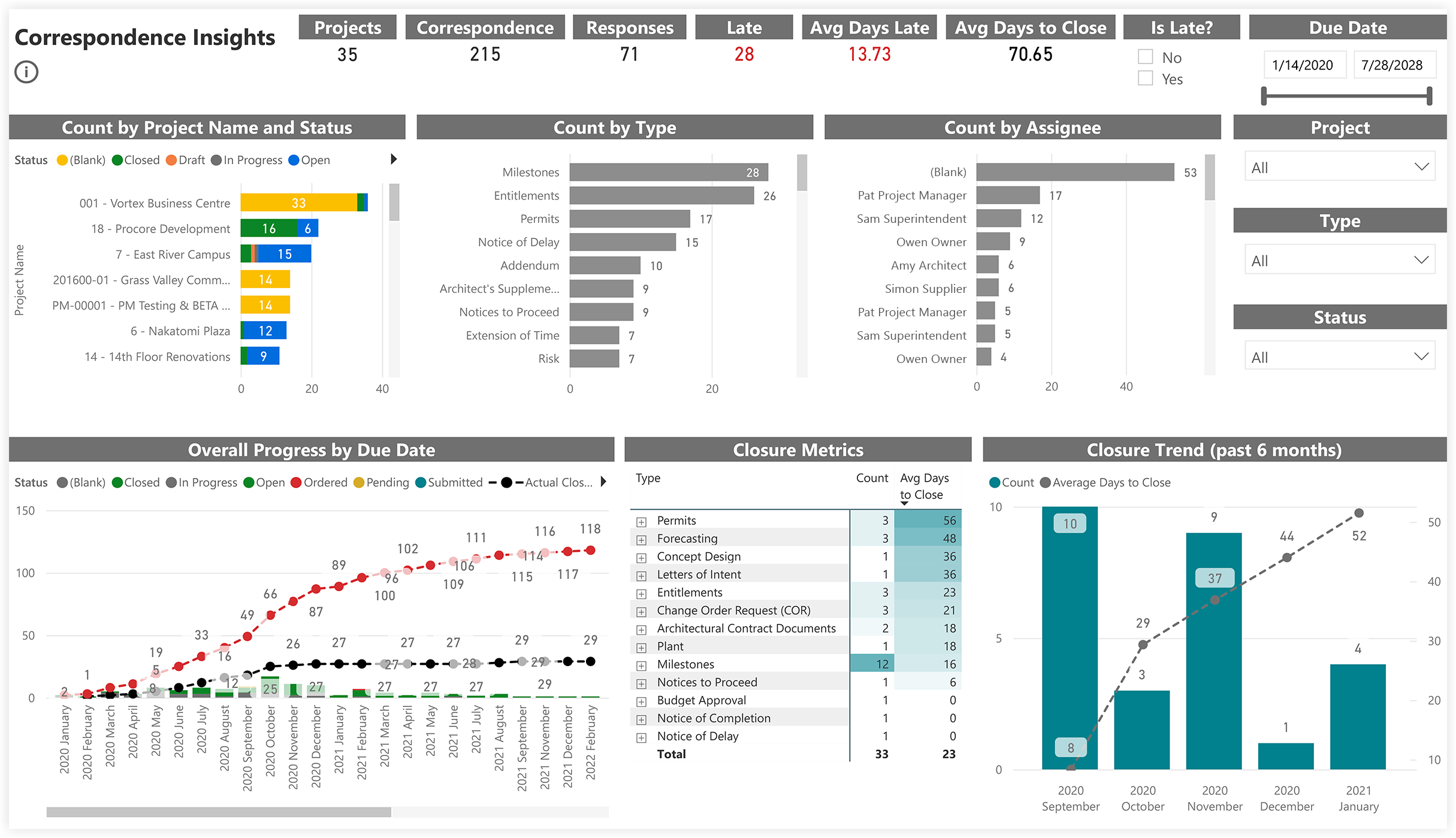
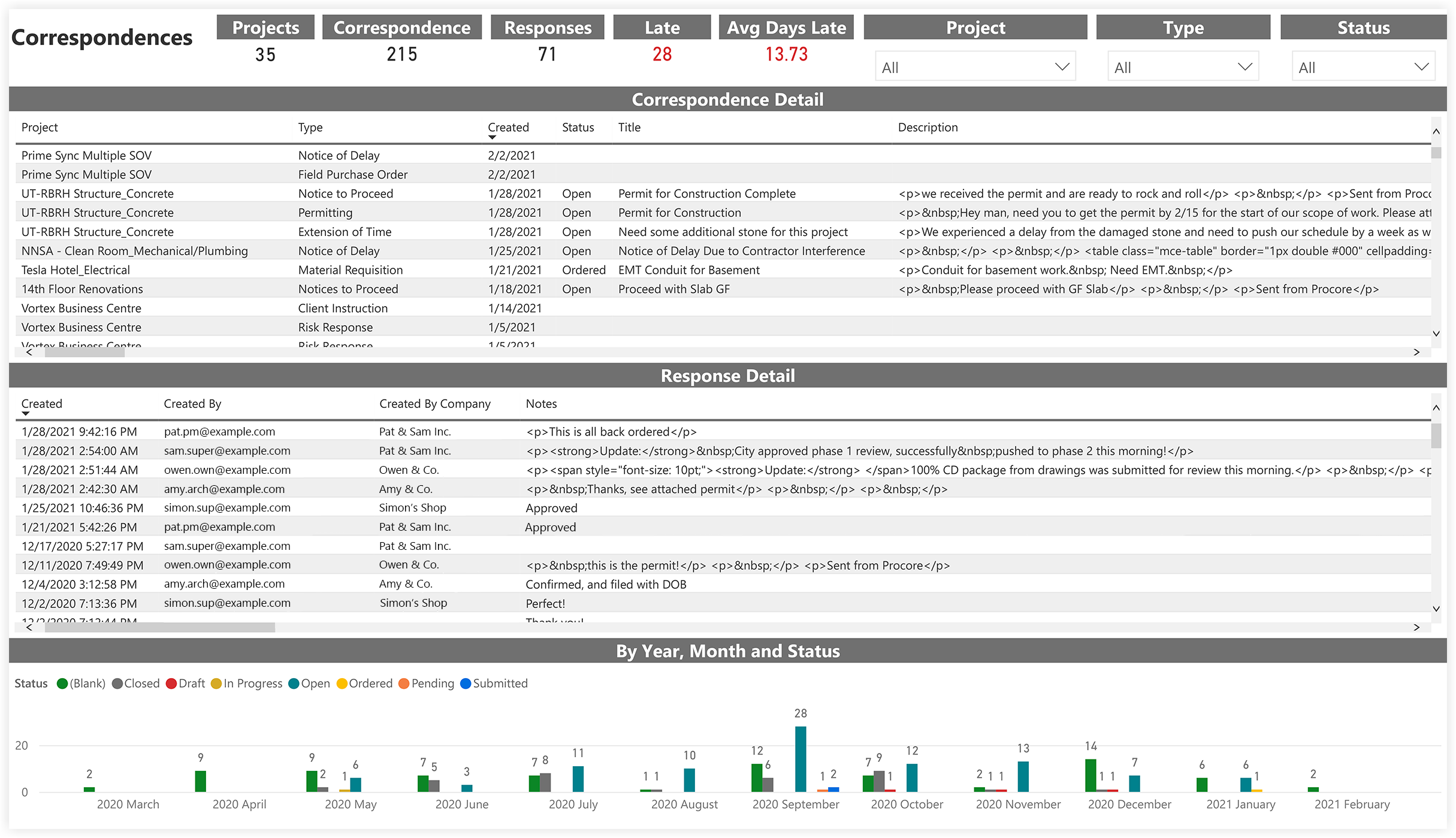
Correspondence
Directory (Project level)
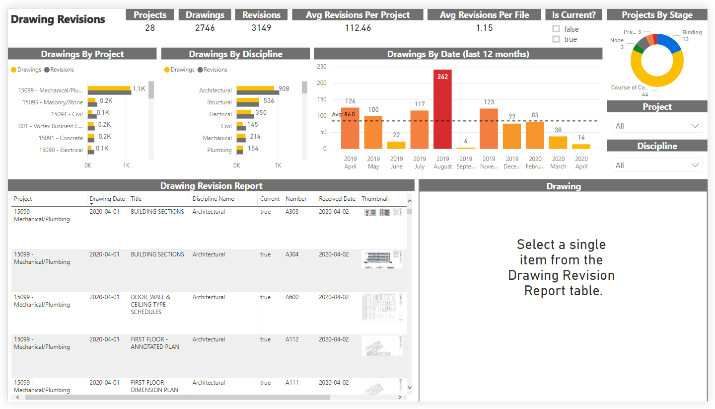
Drawings
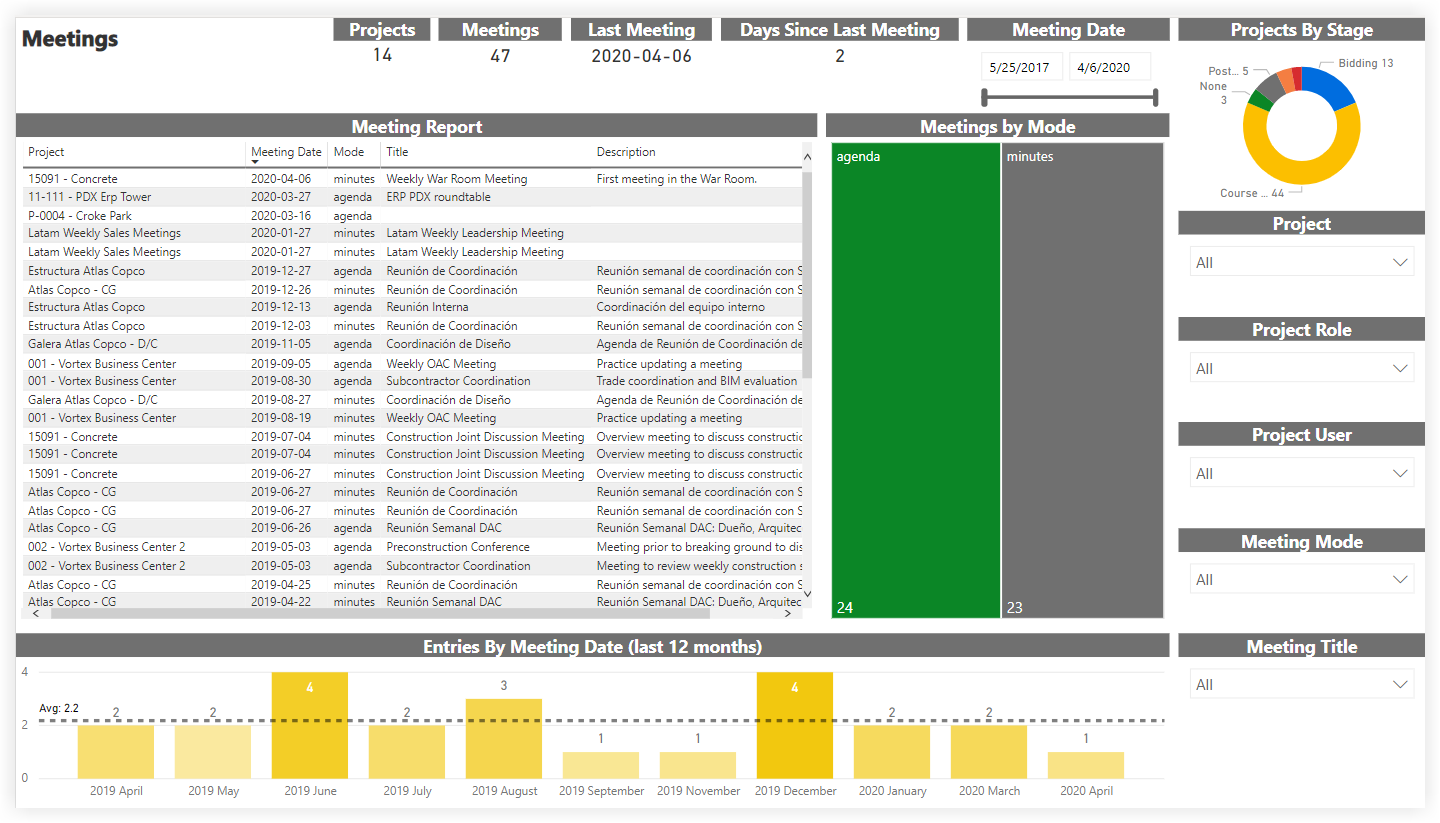
Meetings
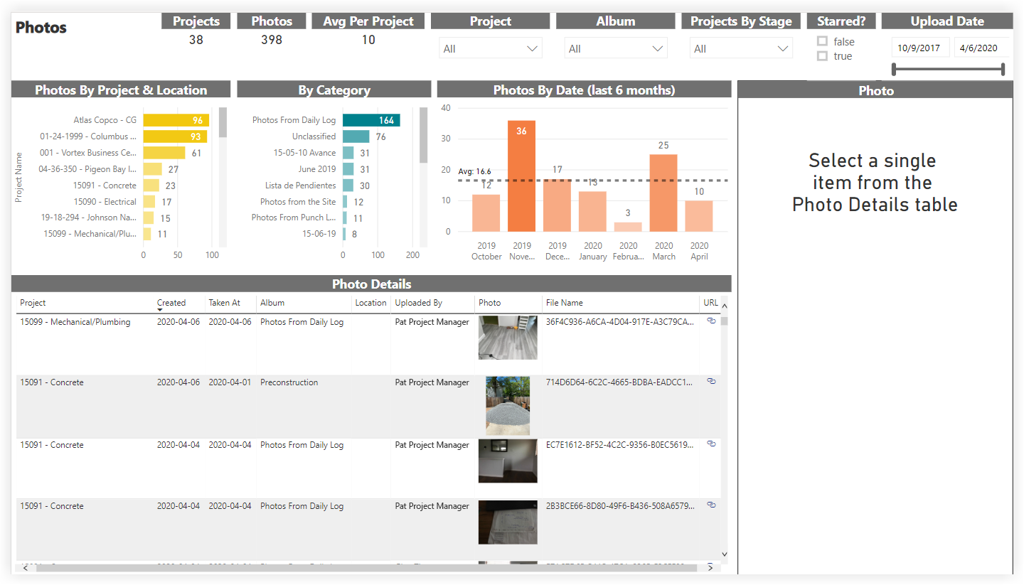
Photos
Punch List
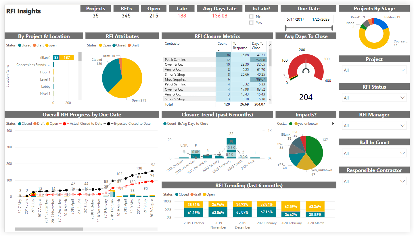
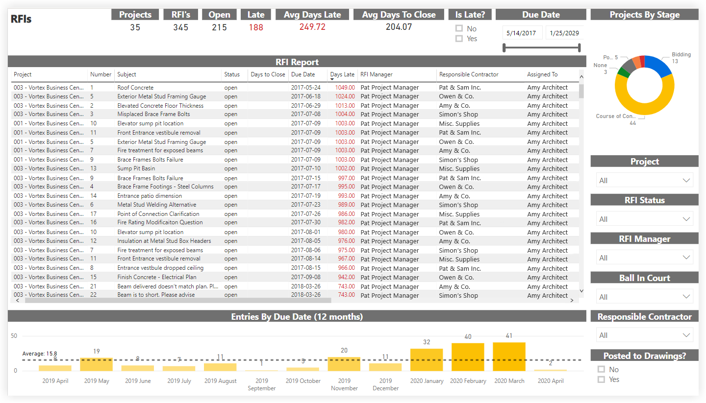
RFIs
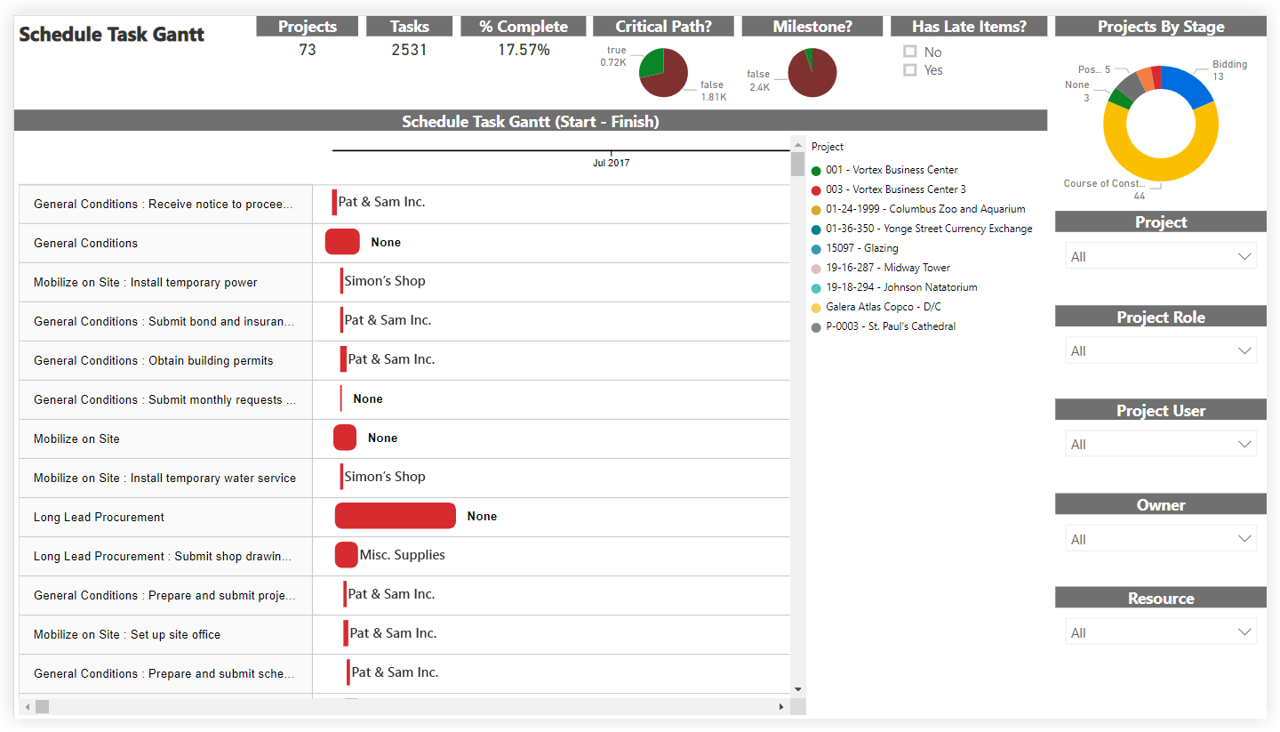
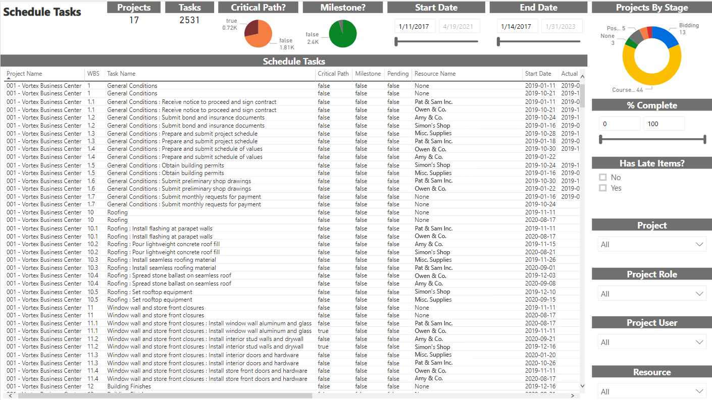
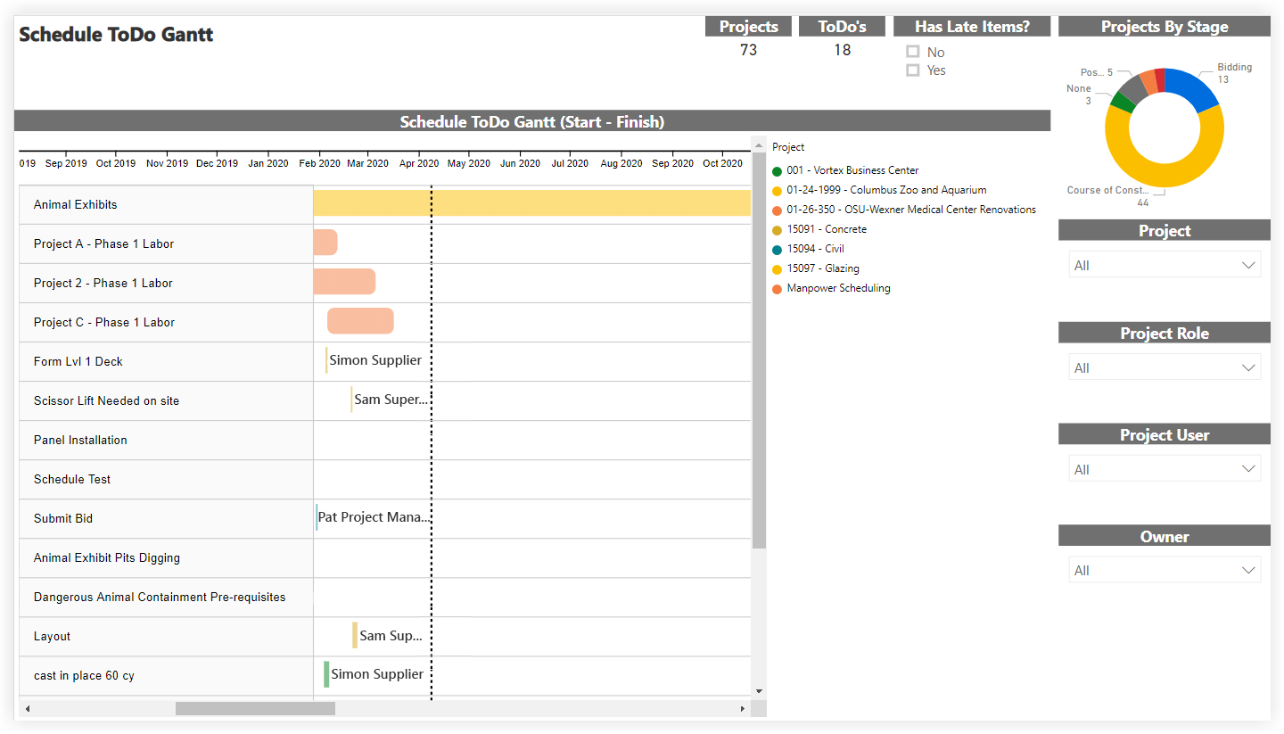
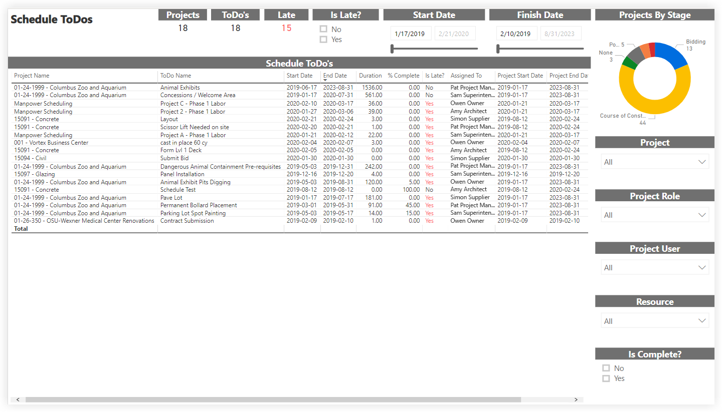
Schedule (Project level)
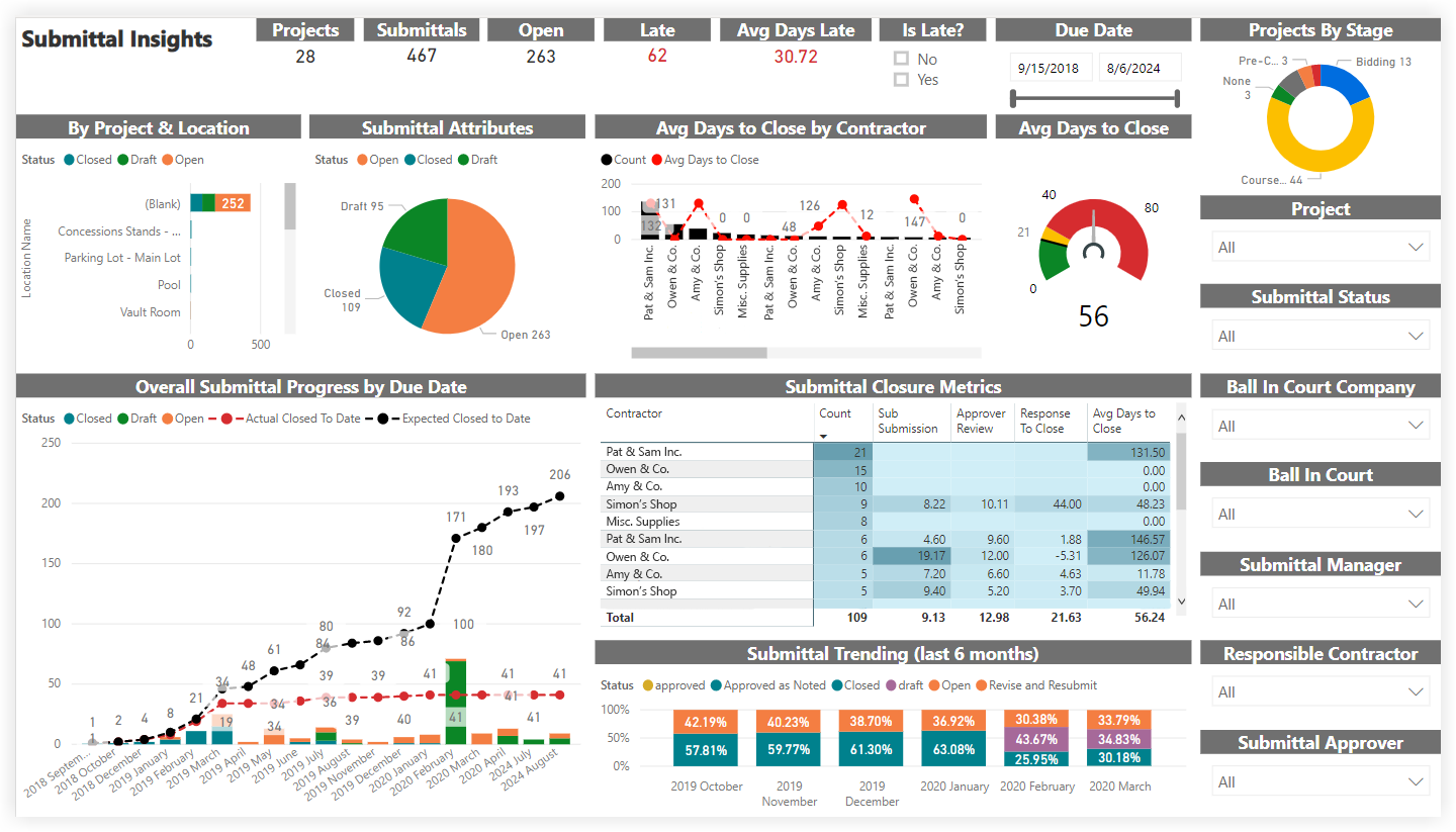
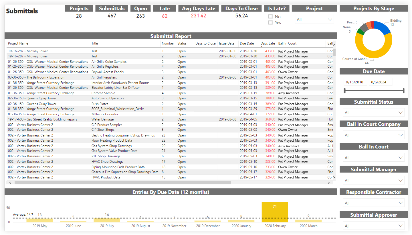
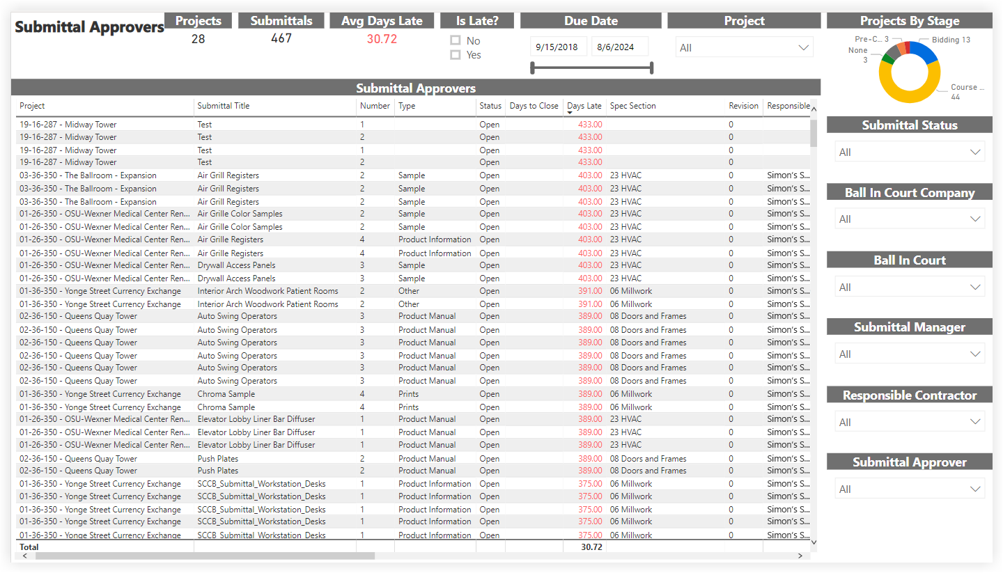
Submittals
Report Pages
Click the report pages below to view a sample report page.
Project Insights
As part of the Procore Analytics Project Management Report, the Project Insights report page provides a high level view of one or more projects. This report page supports drill-through actions that allow you to navigate directly to more detailed report pages for the included Procore tools.
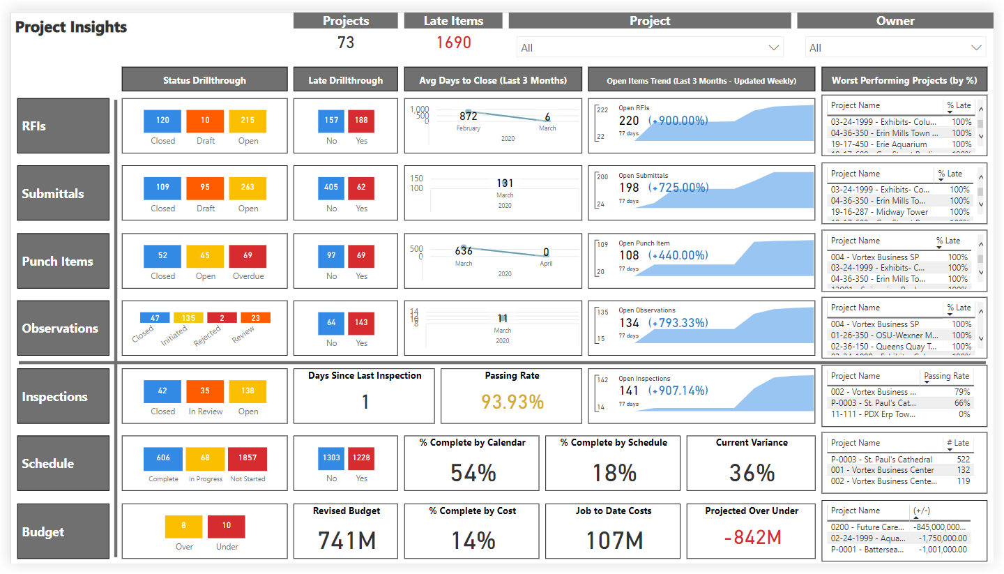
This sample report page was created using mock data for demonstration purposes only.
Project Scorecard
As part of the Procore Analytics Project Management Report, the Project Scorecard report page was designed to quickly identify and quantify late items in proportion to total items using certain metrics. The 'Late Limit' slicer controls the percentage of late items allowed for the included Procore tools to receive a green dot or a red dot. Each project's 'Health Score' is calculated using the 'Late Limit' slicer and the number of green dots. The 'Detail' bookmark changes the view of this report page from dots to percentages, and the 'Summary' bookmark changes the view from percentages to dots.
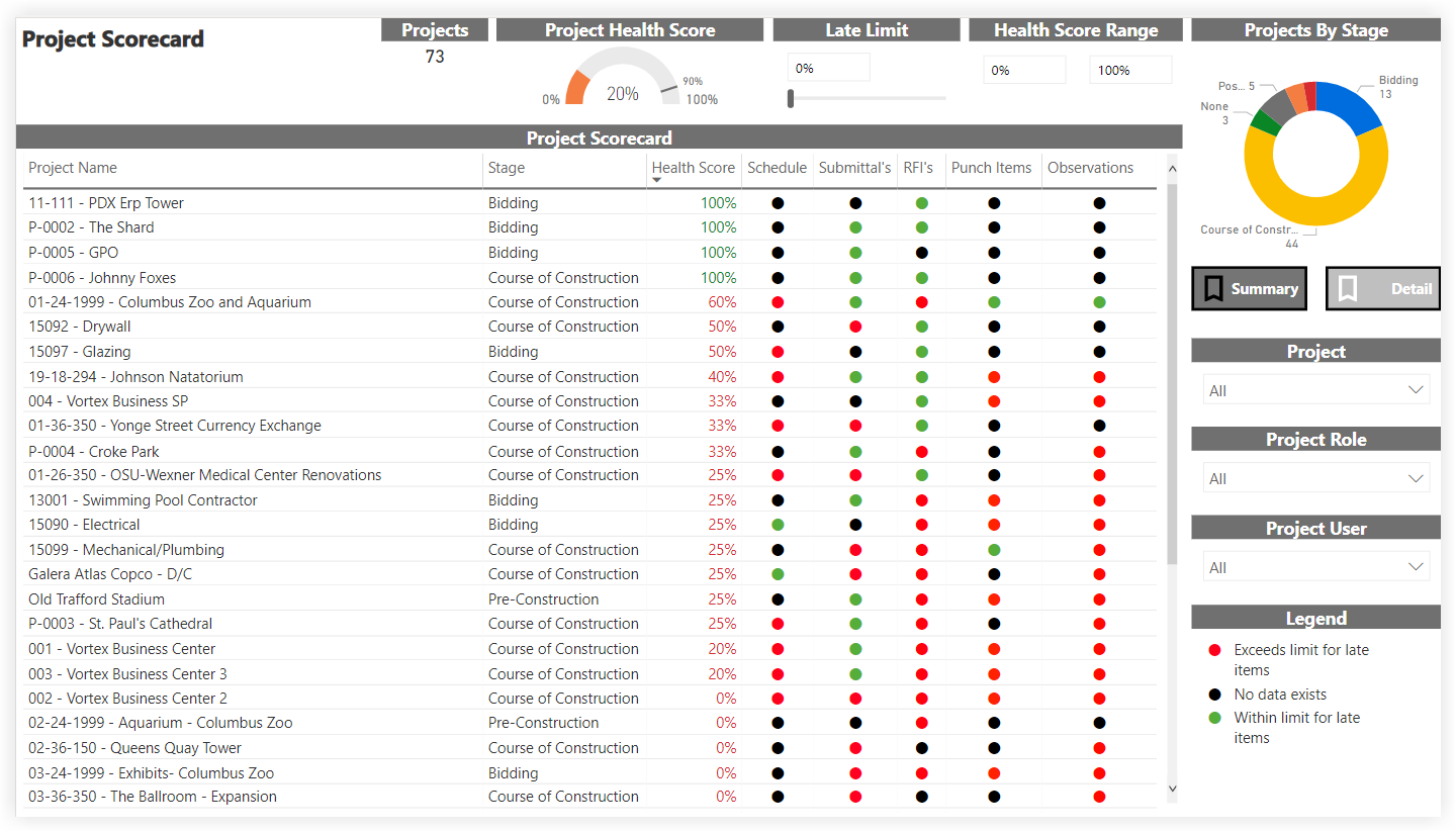
This sample report page was created using mock data for demonstration purposes only.
Key Influencers
The Key Influencers page is part of the Procore Analytics Project Management Report. This page analyzes data from various Procore tools to show the likelihood of a specific item (Submittals, RFIs, or Schedule) to end up being late on a project. Using the Project and Date controls, you can include all available data or narrow the report to look at a specific project or date range.
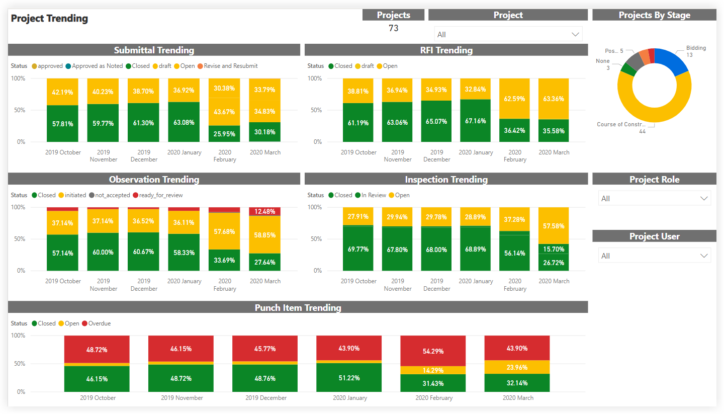
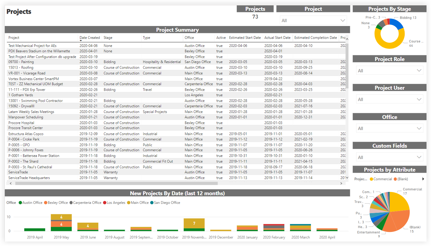
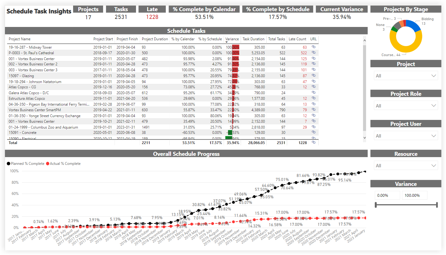
The Projects By Stage donut chart shows the number of projects included in the report's scope by stage of construction.
The main area of the Key Influencers report (for example, the 'Late Submittals' area shown below) includes these tabs: Key Influencers and Top Segments.
The Key Influencers tab lets you select a metric to investigate from the drop-down list. The selected value is Late.
The visual on the left summarizes the factors that contribute to the likelihood of an item being late, along with a calculated estimate (for example, in the illustration below, a submittal on a Residential project is 10.40x more likely to be late than a Public project.
The bar chart on the right displays all values contributing to the result shown on the Key Influencers tab for the selected item. It also shows the threshold at which potential values are shown on the Key Influencers chart.
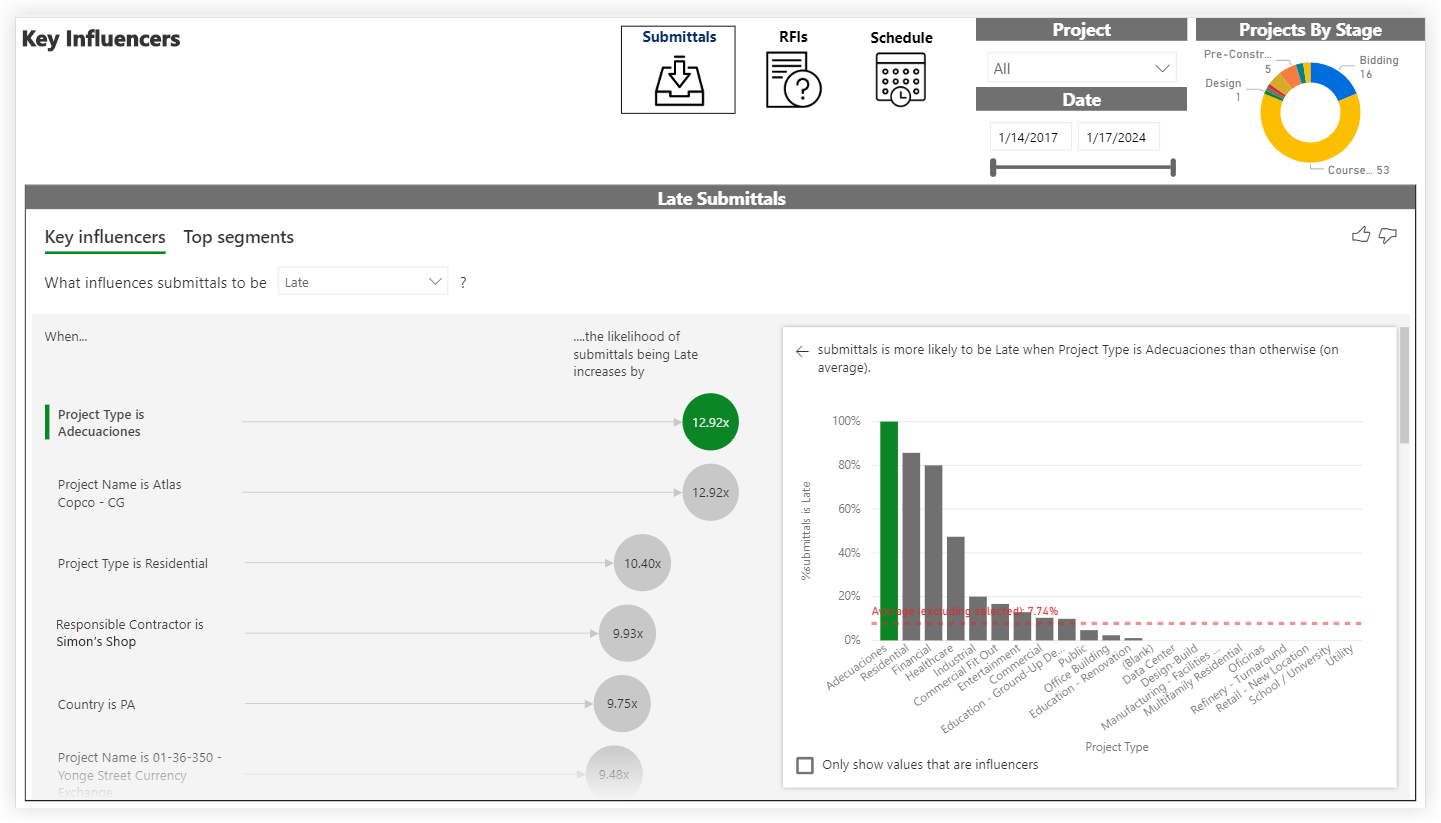
This sample report page was created using mock data for demonstration purposes only.
Root Cause Analysis
The Root Cause Analysis page is part of the Procore Analytics Project Management report. With this page, you can analyze the item data (for example, Submittals, RFIs, and Schedule) in your company's account by various dimensions. Using the Project and Date controls, you can include all available data or narrow the report to look at a specific project or date range. This report contains these visuals:
The bar chart on the left shows the total number of items in a bar chart format, with a numeric count showing the total number of items in each category.
The horizontal bar chart on the lower left aggregates items by the available types. In the example below, submittals are categorized by any default and/or custom submittal type.
The decomposition tree on the right uses Power BI's Artifical Intelligence (AI) to visualize your Procore data and its components so you can quickly perform an ad-hoc analysis by exploring your data across multiple dimensions.
Tip
What can I do with a decomposition tree? To learn more, see this documentation resource on the Microsoft's Power BI site.
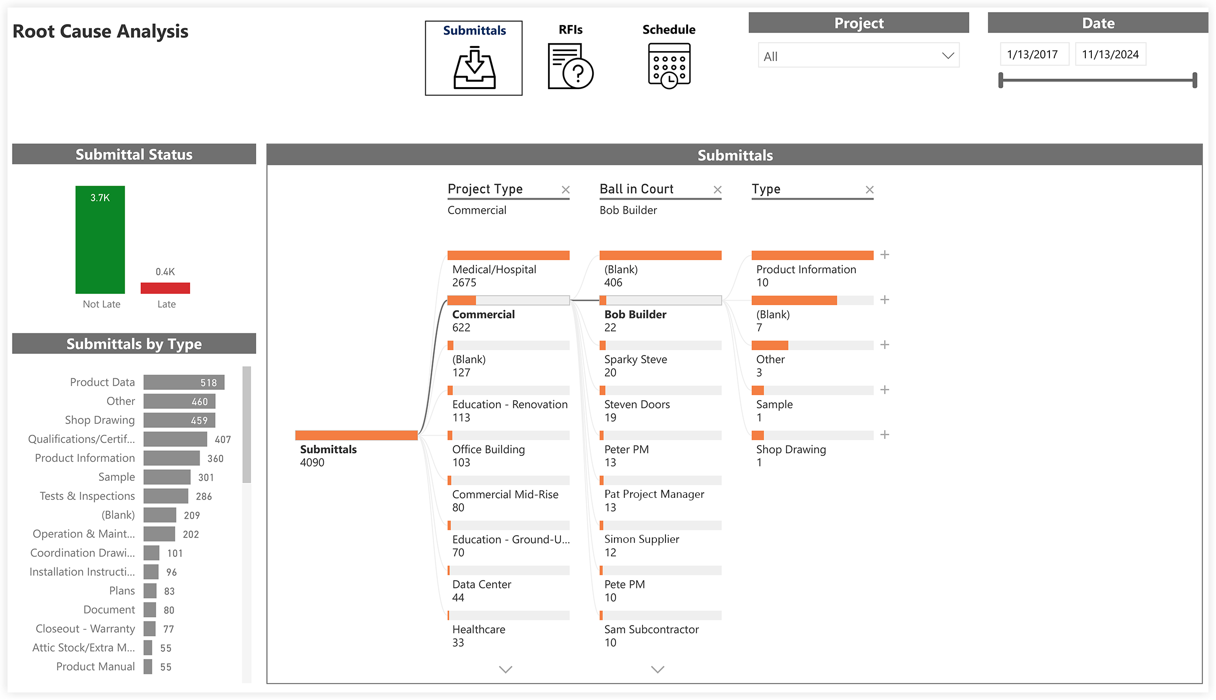
This sample report page was created using mock data for demonstration purposes only.
Project Health Chart
The Project Health Chart is part of the Procore Analytics Project Management Report. This page looks at the number of Projects listed and shows your company's overall Project Health Score. By applying the Project, Project Role, and Project User filters, you can include all available data or narrow the data plotted in the Project Health Chart to better visualize the relationships and variables between the data points on your Project Scorecard.
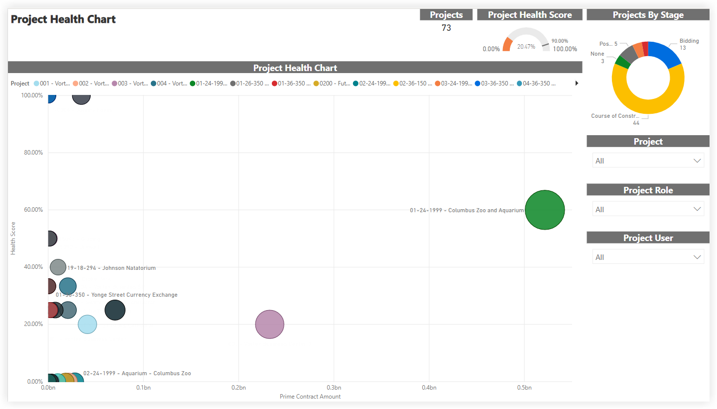
This sample report page was created using mock data for demonstration purposes only.
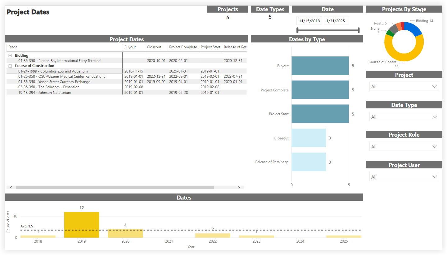
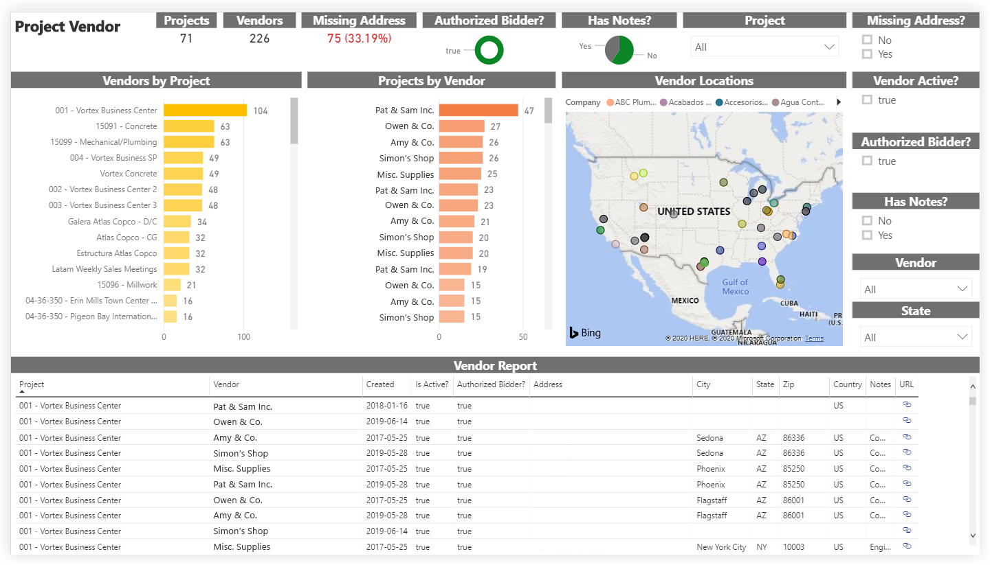
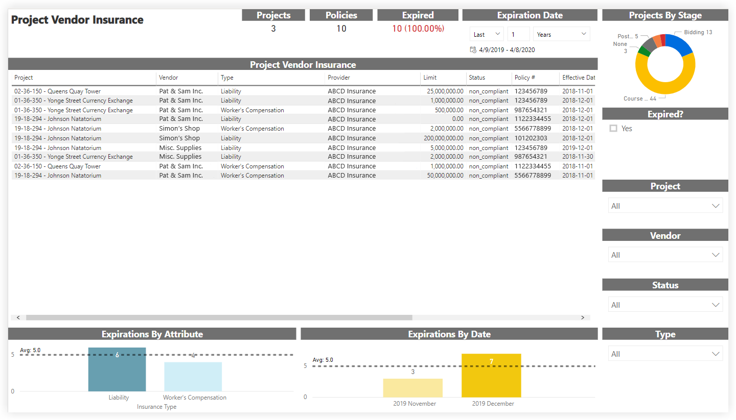
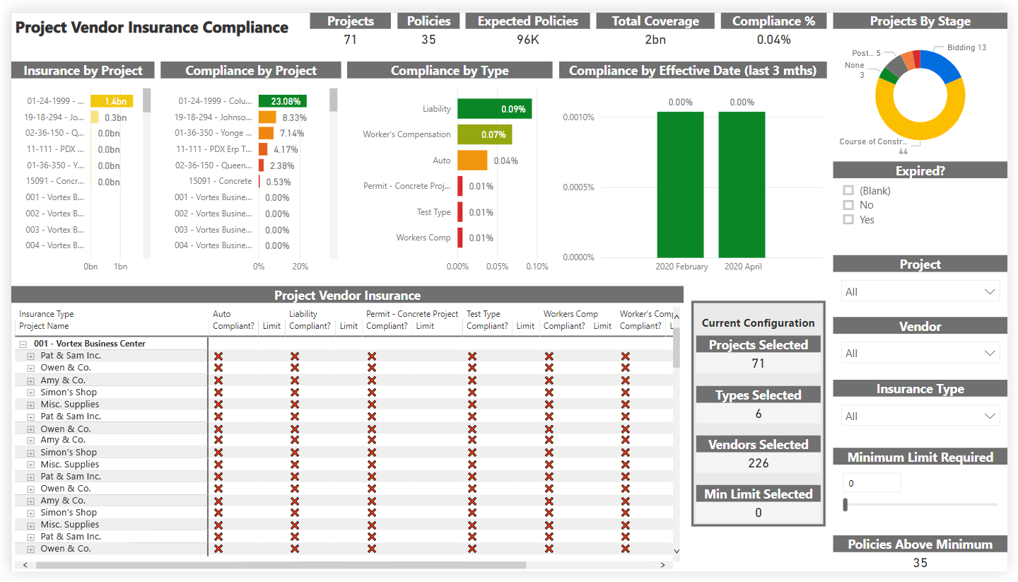
Project Status Report
The Project Status Report is part of the Procore Analytics Project Management Report. The scope for the data is set by the selection in the Project drop-down list. Your Procore user account must be added to the appropriate Project level Directory in order to see a project's data reflected in this page. By applying the Project filter, you can expand the scope for an overview of all projects or narrow the data in view to a specific project. It also shows your company's overall Project Health Score and a donut chart summary of your company's Projects By Stage, with a count of the project(s) in each stage of construction.
The Project Details area shows item status across your company's projects in a pie chart format. For each item, it also shows a count of the late items and summarizes the average number of days for those late items.
The Financial Details area includes a Budget Summary table that shows budget amounts for the selected project(s) and lists totals by 'Division.'
Tips
Why is there no 'Division' concept in Procore? In Procore's WBS, the 'Cost Code' segment is tiered, and there is no concept of 'Division'. Instead, a 'Division' is treated as a tier in a tiered segment. Tiers within a segment are always delimited by a dash (-). Procore's default cost code list has two (2) tiers. However, your environment might have one, two, or multiple tiers. To learn more, see Work Breakdown Structure FAQ.
Can I get a copy of the default cost code list? To download a copy of the default cost code names for your reference, click Procore Default Cost Codes.
Note: This CSV file is for reference only and not formatted for imports into Procore.
The Budget vs. Committed area plots the budgeted values and committed values on your projects using a two-sided bar graph for easy reading.
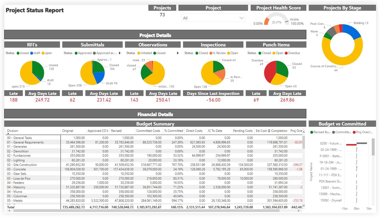
This sample report page was created using mock data for demonstration purposes only.